I’m mad at the Onion A.V. Club right now (no, not really, I love those guys). In my post about the Leap Motion Leap I briefly mentioned my one gripe with the way VR is presented in Minority Report, and that I should write a post about it. That evolved into making a post on the larger topic of evaluating how realistic / crazy out there VR depictions in movies are in general, and when I opened the A.V. Club this morning to read my weekly dose of Babylon 5 reviews (oh yes, I am an unapologetic fan), I saw this: The future won’t look like this: 11 unintentionally ridiculous depictions of virtual reality. Curse you, A.V. Club!
On the danger of looking like a lame copycat, I’ll still do it, because the technical angle I had in mind is different from the A.V. Club’s approach, but if you disagree, tell me off in the comments.
Let’s get going, with a completely subjective selection, and in no particular order.
Star Wars, 1977
What? There’s no VR in it! True, but there are “holograms” in it. And because it’s an extremely common misconception, and I get it thrown at me all the time, I need to say it: real holograms don’t work that way! You know the scene I’m referring to:
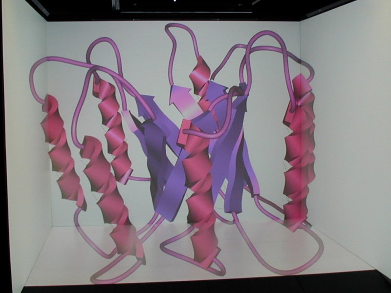
The thing is that real holograms need to be “supported” by a piece of holographic screen behind them — you can only see the part of the hologram that’s between your eyes and the screen. Holograms are free-standing — just not as free-standing as most people subconsciously assume; holographic projectors such as R2-D2’s here are fiction. It’s important because the argument goes: once we get real-time holograms, we won’t need to build CAVEs anymore. Technically true, yes, but you’d need to build a space enclosed by holographic screens to get the same effect as a CAVE, so basically the same thing. Sorry.
Verdict: Fiction!
Disclosure, 1994
But this one’s in the A.V. Club article! True, and I feel bad about copying them even more blatantly. But I have to amend what they’re saying. I have no beef with their evaluation on the ridiculousness scale, but from a technical point of view, VR as depicted in Disclosure, at least in the following scene, exists and is used today:
Let’s see: tracked head-mounted display, tracked data glove, omni-directional treadmill, 3D scanner that captures a real-time 3D image of the user and projects it into the virtual space — I have all that in my lab, minus the treadmill (unfortunately). I’m even working with architecture firms. Walking across a virtual cathedral to access files, and a bottomless chasm in the middle of your database server for no reason? Yeah, that’s silly.
Verdict: Nailed it!
Minority Report, 2002
This one’s interesting. There are two VR bits in it: the famous “maestro-style” free-hand GUI, and the 3D home movie. Let’s tackle the simple one first, the 3D home movie:
The 3D video itself looks exactly like the kind of video you can capture with a 3D camera like the Kinect, down to the fringe triangle artifacts (someone on YouTube even made a mash-up between this and my first Kinect video; it’s uncanny). The projection system is another story: at first glance, it’s another completely free-standing hologram (fiction!), but a bit of fanwank can explain that it was actually a projection onto a 3D multi-viewpoint fog projection display (exists! just not quite as good yet).
Partial verdict: Nailed it!
The part with which I have a gripe is the 3D GUI:
From a technical point of view, we could have built that in 2002: tracked data gloves (had them in my lab in 1998, albeit with wires), projection onto a translucent screen (nothing to it), gesture interface, we could have rigged up a physical data transfer module (it’s basically a transparent USB stick, right?), etc.
So here’s my gripe: the whole thing makes no sense. Some people have issue with the manual data transfer — why not send the data over the network? — but you could fanwank that as a security issue. No, the problem is why use a 3D user interface in the first place? Look exactly at what he’s doing. All the data with which he’s interacting are 2D — text, images, movies. All the interactions are 2D: he moves and pinch-zooms, he rotates in the screen plane. Oh, and kind folks who did the annotation? It’s not a “holoscreen” — it only shows 2D images, so it’s simply a “screen.”
There is no free 3D manipulation, so why is he using a free 3D user interface? It’s bad, ergonomically. Holding your hands out like that for precise work over an extended time (more than a few minutes) is painful. The syndrome is called “Gorilla Arm.” The ideal hardware and UI for this type of work is a multi-touch surface device, probably set not vertically, but at an angle like a drafting table. Then your hands and fingers have something to rest on and push against for the interactions, which makes them much easier and less painful.
Why am I harping on this? People are rushing to recreate this interface, now that the hardware is cheaply available, because it looks extremely cool in the movie. It fooled me for the first two times watching. So people are working hard trying to make an interface that’s literally painful to use, and people actually trying it will hate it, and the backlash will hurt us all. Please, don’t do it.
Partial verdict: Nailed it technically, but failed ergonomics
Iron Man, 2008
This one I love:
It starts out like the Minority Report GUI, but then it gets good the moment the suit’s 3D model appears over the virtual workbench. I’m wondering if that’s intentional one-upmanship: start out just like the other, and then blow it away.
Anyway, let’s look at the technology: free-standing 3D display above a virtual workbench, hand tracking and gesture interpretation without data gloves. Pushing it, but we have the Kinect, we may soon have the Leap, and we can always imagine that he could be wearing stylish VR goggles in Tony Stark’s inimitable style. Or, alternatively, assuming that what we’re seeing in the movie is a representation of what Tony sees, and not what another person in the camera’s place would see, and the former could be only the part of the 3D model that’s between him and the workbench screen, which could be auto-stereoscopic, then it’s entirely today’s technology.
So with a bit of squinting and allowing for the Hollywood glitz filter, yes, we can build that. As for the interaction: tell me it doesn’t look exactly like this, again accounting for the glitz filter, and me using only one hand (we have a second input device now):
Now you might ask: why am I lauding free-space 3D interactions here, when I decried them in Minority Report? Simple, because here they are used for actual 3D manipulation, where you accept a bit of discomfort because there’s no better alternative. And you’ll also notice that he’s holding his arms in a more comfortable position, not at shoulder height (or only for as long as required to grab an object). That makes a huge difference, and it’s what our users do when they spend long hours in the CAVE.
Verdict: a bit shinier than what we can do today, but overall Nailed it!
Iron Man 2, 2010
Several scenes in this one. The first is the coffee table scene:
Pretty standard multi-touch surface display and interactions. Not really VR, as it’s all 2D, but worth a mention anyway. Verdict: Nailed it!
The workshop walk-through scene:
Similar to the scene from the first Iron Man, this one features completely free-standing 3D imagery, implied to be free-standing holograms, and therefore fiction. But in the context of the movie, it’s entirely possible that his entire workshop is panelled in auto-stereoscopic displays, and that the movie is only showing us what Tony sees. That could be done today, but it’s not close to practical, a huge stretch, and because of the common misconception about holograms, I’ll have to give it a demerit. Add to that the fact that the user interface here is a lot more “do what I mean” than in the first movie’s scene. There, the gestures he performs correspond directly enough to actions on the 3D model that a good 3D UI can explain it, but here it’s over the line. This UI, as depicted, can only work if a strong AI is running it. Since we already know that Tony employs a strong AI as an assistant, that makes sense in the context of the movie, but sadly it’s fiction.
Overall verdict: Fiction!
All right, that’s my list for now. I’m not going to touch the Matrix, Thirteenth Floor, eXistenz, et al., because those are obviously pure fiction. But if I forgot anything that deserves mention, because it depicts an internally consistent combination of display hardware and user interface that may or may not exist or be theoretically feasible, please let me know below. I have Netflix.
D’oh, I forgot one, especially embarrassing because I mentioned Babylon 5. How could I!
Babylon 5, And The Sky Full Of Stars, 1994
Can’t find a clip, but here’s the episode recap on the Lurker’s Guide. Synopsis: the station’s commander gets kidnapped and interrogated by being strapped into a virtual reality system, so that the interrogators can mindscrew him and break him more easily. The VR system itself is not thought through enough to be analyzed, except the display bit itself: it’s a retinal projector, shining the image of the virtual 3D world directly into the user’s eyes (only into one eye in the episode, sad oversight). Exists!
The input part of the system, on the other hand, must use some kind of neural interface, because the user (or captive in this case) can move inside the virtual world normally while being strapped into a chair in the real world, so Fiction!
How the interrogator, or the commander’s virtual body, get mapped into the virtual world is not even addressed, so Didn’t think about it!
Let’s just say I like this episode in spite of the VR stuff, not because of it. It’s just a TV show, after all.


